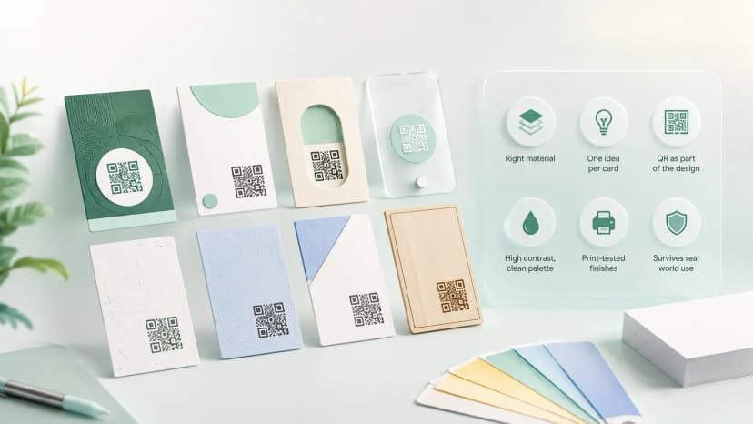
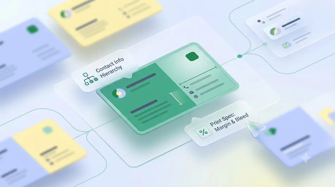
A good sample for visiting card design is worth studying for its structure. What separates a visiting card sample that works from one that just looks busy is hierarchy: your name reads first, your number second, and everything else stays smaller. Below is what to look for in a sample, how samples change from one trade to another, and the print specs any design has to meet before it goes to a press.
What to look for
- Read a sample for hierarchy, restraint and whitespace before you look at its colours.
- The trade decides the tone: clinical and pale for a clinic, dark with metallic accents for a jeweller, a list of trades for a contractor.
- A sample that ignores 89 x 51 mm, 3 mm bleed and 300 DPI will not print the way it looks on screen.
- We do not hand out downloadable templates. Our design team sets up the artwork when you buy a card.
What does a good visiting card sample show you?
One clear hierarchy, with the name largest, the role or business next and the contact smallest but still readable at arm's length; if three things compete, none wins. Restraint on contact details, because one number people actually answer beats three they have to choose between. Whitespace that is deliberate, since the empty area is what makes the printed area readable. And a QR with room to breathe; a visiting card example that crowds the code against an edge will fail at the counter.
What is the standard visiting card format?
The standard visiting card format puts the business name or logo at the top of the front, then your name, role and one phone number, and keeps the back for an address, a second contact or a QR code. Most printers expect exactly this layout, and it is the one worth borrowing from any visiting card sample India shops hand across a counter. A company visiting card sample follows the same format with one fixed brand frame, and only the name and designation change from person to person.

How do visiting card samples differ by trade?
The same layout does not suit every business, because the person reading the card is deciding something different in each case.
| Trade | Tone and colour | What leads | What the reader is deciding |
|---|---|---|---|
| Doctor or clinic | White or pale blue, clinical | Qualification beside the name, consulting hours | Whether to trust and when to come |
| Jeweller | Dark with gold accents | The brand name and the material of the card itself | The price bracket, before a word is read |
| Contractor | Plain, high contrast | A list of trades taken | Whether to call at all |
| Salon | Soft colour, one photograph | A single photo of the work | Whether the style suits them |
| Shop or trader | Brand colour on a light base | Business name, what you sell, one number | Where you are and whether you stock it |
Which print specs must every sample respect?
Any sample for visiting card printing in India should use 89 x 51 mm with 3 mm bleed on every side, artwork at 300 DPI in CMYK, and all text kept 3 to 5 mm inside the trim line, because a guillotine drifts slightly across a real production run. The visiting card size guide has the full chart in mm, inches and pixels, and the visiting card background guide covers what fills that canvas without swallowing the text.
What is wrong with any printed sample?
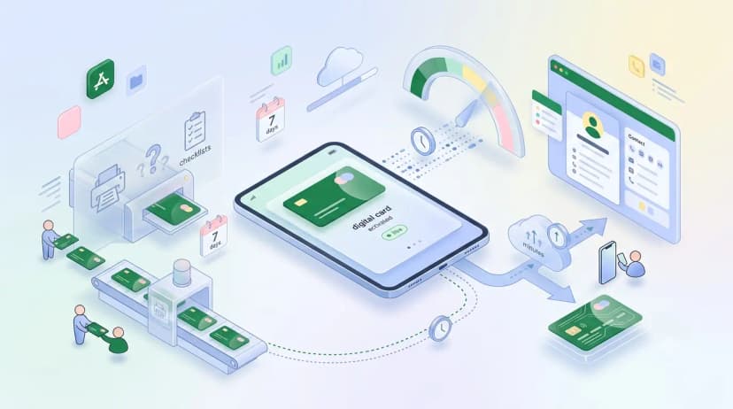
Every visiting card example you admire has one built-in limit: it is fixed the moment it is printed. Change your number, move premises or add a service, and the rest of the box is waste. A good card on 400 GSM stock still makes an impression that a tap alone does not, so keep printing. Just add a QR code that opens something you can edit.
What a QR or NFC profile adds to it
- The front stays minimal because the details live behind the scan
- A new number or service updates every card already handed out
- The card opens your full profile, so it does not have to carry everything itself
Where a printed sample stops
- It is fixed on the day it prints
- Every change means a reprint and a bin
- It can only hold what fits at 89 x 51 mm
Before you brief a designer
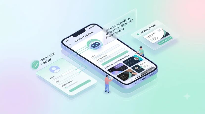
- This post is not a template library. Our team's design work comes with a purchased card and is built around your name, logo and branding; the free plan covers the digital profile only.
- Copying a competitor's layout in the same city reads as a copy. Borrow the structure and bring your own colours, type and material.
Start with the profile, add the card when ready
You can build the profile free in a few minutes with a digital business card and use its link as the QR target, whether or not you order a physical card from us. If you do order one, the design team sets up the artwork before printing and links the card's chip and QR to your profile. For broader inspiration, see creative visiting card ideas.