
The best creative visiting card ideas are the ones that still work at 89 x 51 mm. Plenty look striking on a designer's screen and fall apart at the press: fine patterns turn to mud, text gets trimmed off, and foil can cost more than the rest of the order. The ideas below are grouped by what they change, the material, the layout or what the card can do, because each of those costs something different, and each one holds up once it is printed.
Three rules before you design
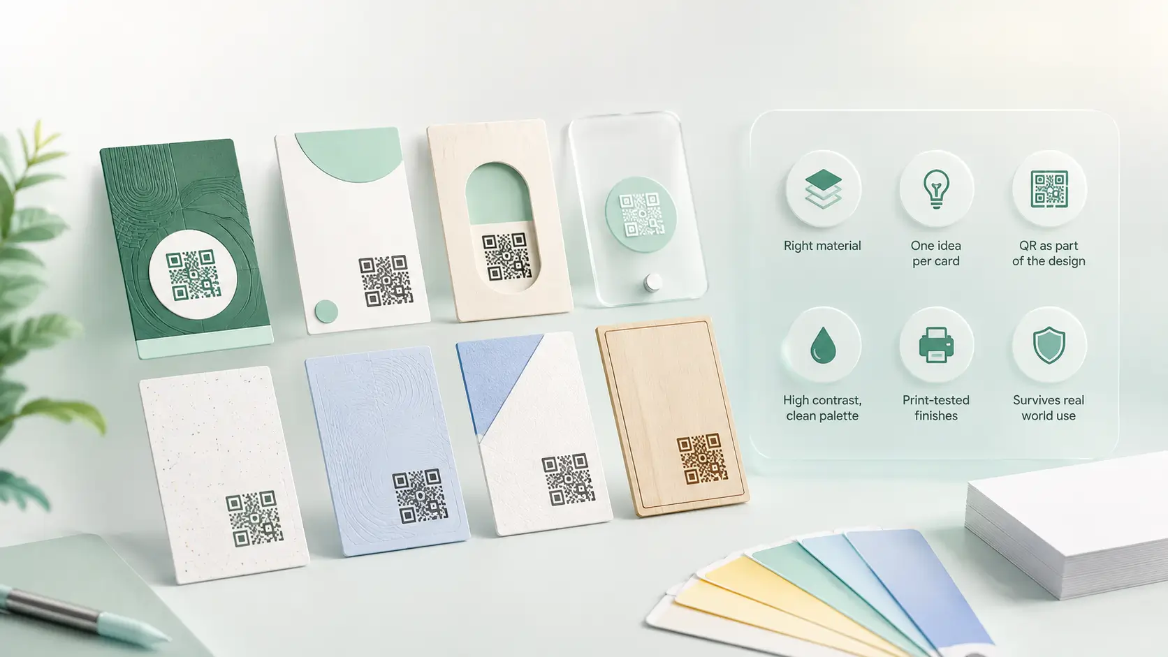
- Change the material before the layout. Wood or metal gets noticed in the hand before anyone reads it.
- Pick one idea per card: a colour band, a texture or a shape. Using all three cancels each one out.
- Plan the QR from the start at 15 to 20 mm with a two-word label. Added to a corner at the end, it looks like an afterthought.
Why is material the idea most people skip?
Because most briefs start with a layout. Before you touch one, think about what the card is made of. A wooden card is noticed by hand before it is read, and no amount of layout work buys that. Metal does the same at a higher price (PVC from ₹599, wood ₹1,299, metal from ₹1,899, all one-time), and PVC survives a wallet where 300 GSM paper goes soft. Of all the unique visiting card ideas in this post, material is the only one a competitor cannot copy from a photo of your card.
Which visiting card design ideas hold up in print?
Most creative visiting card design ideas fall into one of the six below. The last column is the one designers tend to skip.
| Idea | What it does | Extra cost | Watch out for |
|---|---|---|---|
| One idea per card | Reads as expensive through restraint | None | The temptation to add a second idea |
| Use the back | QR, service list or one line of positioning without crowding the front | None | Leaving it blank, which most cards do |
| Vertical orientation | Stands out in a stack | None | Does not sit flat in most card holders |
| Oversized type for the name only | Reads across a table | None | Everything else must shrink to let it lead |
| Wood, metal or PVC | Noticed by touch before reading | Material tier | Pairs badly with busy artwork |
| QR or NFC as a feature | Keeps the printed side minimal; details live behind the scan | Chip only | Needs a quiet zone and a label |

How do I design the QR into the card?
A QR code pasted into a corner at the last minute looks like a last-minute addition. Planned in from the start, with its own quiet zone, a size of 15 to 20 mm and a two-word instruction, it becomes part of the design. It also changes what the card has to carry: the printed side can stay minimal because the rest lives behind the scan. The sizing rules are in the QR code size guide.
Creative visiting card design by profession
A professional creative visiting card design starts from what your trade is already known for, and a unique creative visiting card design usually comes from one bold choice rather than five. For graphic designers, let the card itself be the sample: one confident type treatment and a QR straight to your portfolio. Interior designers can let the material speak, since a wooden card suits a practice built on finishes.
Photographers do better with a clean front and one image on the back, with the full portfolio behind the scan instead of printed. For salons, match the single accent colour to the shop sign so the card and the shopfront read as one brand. Restaurant owners can put a QR to the menu and location on the back, where a guest will look for it.
Which ideas look good on screen and print badly?
Ideas that survive the printer
- A single accent colour on a light base
- A texture you can feel, built into the card stock itself
- Type large enough to read at arm's length
- A QR with a margin and a label
Ideas that fail at the press
- Hairline type under 6pt, legible on screen and invisible in hand
- A fine repeating pattern behind text, where the pattern wins and the phone number loses
- Full-bleed dark colour: heavy ink, visible fingerprints, tone shifts between batches
- Die-cut shapes that jam in wallets and cost far more than a standard cut
Two trade-offs
- Whichever direction you take, the printed layout is fixed the day it comes off the press. A new number or title turns the remaining box into waste.
- Material costs more per card. It pays back when people keep the card, and less so when you hand out hundreds at an event.
The one idea that keeps working
Print a link on the card and keep the details in a profile behind it. Change the profile, and every card you have already handed out points to current information. An NFC visiting card does the same thing with a tap instead of a scan. Finished layouts are in the visiting card samples post, which shows what good creative visiting card ideas look like once printed, and the visiting card size guide has the print specs. For colours and textures behind the text, see the visiting card background guide, or compare materials in the NFC cards collection.